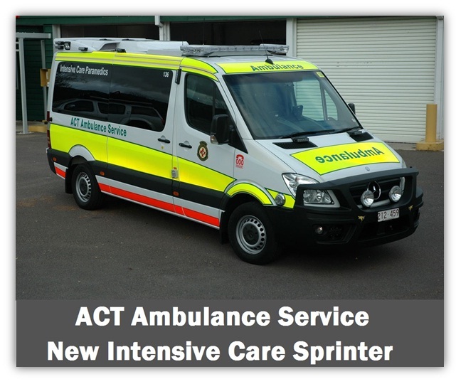
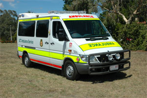
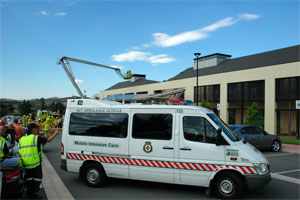
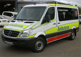
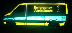
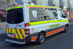
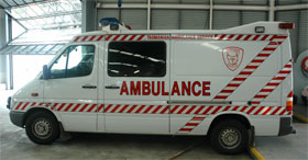
The ACTAS 3M Diamond Grade fluorescent yellow-green and orange livery was first introduced for trials in 2004 following a major report in 1999 by John Killeen. These images show three generations of Mercedes Sprinters up to the latest version in August 2008. The orange and yellow/green combination provides the best observer response combined with long viewing distances. The orange stripe is kept narrow so the livery is always yellow/green dominant in proportion to the vehicle surface area. White reflective outline stripes are invisible in daylight so they do not corrupt the vehicle profile .
The lighting is all LED and includes both amber and red steady-burn lamps. Note that all text and signage remains subordinate to the yellow/green coloured livery. The third generation vehicle moves from block capitals to upper & lower case text for increased legibility. The plastic kangaroo bar has proven very effective in reducing vehicle repair costs and downtime after a kangaroo strike.
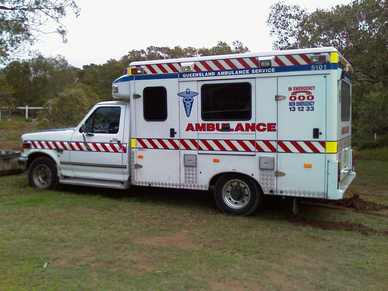
Queensland Ambulance Service
QAS moved to the new Reflexite fluorescent red and lime livery with all LED warning lights in 2007 after information exchanges with John Killeen and ACT Ambulance. This changeover to a higher visibility livery and new warning lights achieved a considerable cost saving over the earlier design, demonstrating that increased safety can be achieved at lower overall costs. The thicker red sill stripe increases the red colour influence over the lime reflective side panels making this design almost a bi-colour format (no single dominant colour). Lime accent trim is used around the bonnet and front doors. The Queensland design uses the window area for large-scale signage. Later model Queensland vehicles are fitted with kangaroo bars. RHS Image from QAS Media release
South Australian Ambulance Service
SAAS changed livery in 2007 following a trial period that included a vehicle bearing battenburg markings. This battenburg influence is clearly seen in the rear chevrons, however the side markings were replaced with the SA corporate green and lime Reflexite. The visibility factor during daylight from the side is dependent on the fluorescent lime outline stripes.
If chevrons are to be fitted to an ambulance, the SAAS coverage in the preferred colours of red and yellow are a good example of optimum design; SA uses wider stripes that are less dazzling than many examples found overseas. Staff advise the chevron feature is very popular with crews attending highway incidents in rural areas. The very dominant yellow reflective text and badging has been moved to the window areas.
Three images provided by the CFS Promotions Unit
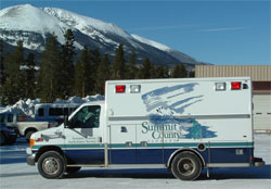
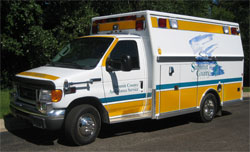
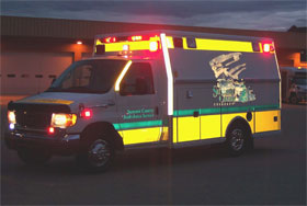
Summit County EMS, Colorado USA
The change from blue on white livery to fluorescent reflective yellow by Summit County was undertaken due to the snow and dark forest backgrounds found in the mountains. John Killeen provided visibility and conspicuity information to Summit County to assit with the transition to the new markings. The fluorescent yellow colour of markings on the vehicle were chosen deliberately to contrast with the lime green jackets and safety vests worn by EMS staff when working around the vehicle during the day. The upright corner pillars on the rear compartment carry white reflective tape that is only visible at night. Note the reduced size of the SC logo and how the discrete colour does not substantially detract attention from the yellow livery.
Images provided by Summit County EMS
Tasmanian Ambulance Service
The Tasmanian’s introduced HiVis markings in 2006. The second generation design (not shown) was based on and almost identical to the ACT Ambulance design. The third generation has additional fluorescent orange stripes and half-door chevrons on the rear of the vehicle. As with other States and Territories the curved mouldings of the bodywork have moved some signage onto the windows. This design is another example of a bi-colour format.
Airservices Australia –
Aviation Rescue & Fire Fighting
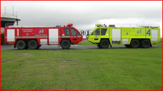
The new RosenbauerMark 8 aviation fire vehicles for Australian airports were launched in late 2008. The earlier model fire vehicles were red in colour and John Killeen worked closely with Airservices Australia during the transition to the new yellow-green paint colour. The chequered stripe on the old red vehicle demonstrates clearly that the pattern is ineffective over distance and does not add to conspicuity at all. The new vehicles now carry wide solid colour fluorescent reflective waistline stripes and thinner outline contour striping to further enhance the vehicle conspicuity during twilight and darkness.
The fluorescent markings are designed to clearly display the vehicle’s size, shape and purpose at dusk, dawn and at night, yet not detract from the yellow-green visibility profile in bright daylight. As airports increase in size the fire vehicles have to be clearly seen & identified in all weather conditions over much longer distances and measured in kilometers rather than hundreds of meters . Comparison testing at airports has shown the benefits of the new yellow-green painted trucks over the older red vehicles, especially at extreme distances (see link to comparison images).
ARFF fire vehicle colour comparison images – CLICK HERE
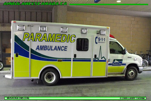
Muskoka EMS began collaborating with John Killeen in early 2009 when they decided to move away from an earlier vehicle livery that had no Hi-Viz elements. Their area of operations in Canada meant their predominantly white ambulance was surrounded by a snow-covered landscape during winter each year.
This ambulance is good example of incorporating high-visibility fluorescent colour into a pre-existing corporate livery. The white reflective contour markings that outline the vehicle (and seen only at night) are invisible in daylight so the vehicle shape remains readily apparent. The corporate logo has been reduced and relocated to the doors and the text colour has been changed to increase reflectivity. The revised livery demonstrates how Muskoka staff successfully played a major role in redesigning their vehicle markings by accessing specialist knowledge. Photos by Muskoka EMS and Larry Thorne
Read the Muskoka Ambulance article in Canadian Emergency News magazine – CLICK HERE
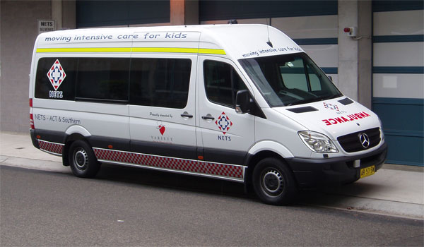
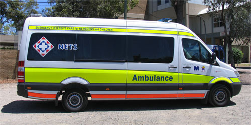
NETS Neonatal Intensive Care
Working in Sydney & across regional New South Wales, Australia
The NETS neonatal emergency transport service was expanding in 2008-09 and in turn NETS also became an independent ambulance transport body across the State of NSW. During the transition, NETS approached Ambulance Visibility with a request to design a livery similar to the ACT Ambulance markings. The current markings on their ambulances were not being recognised by the public as an emergency response vehicle. The new fluorescent markings are almost identical to the ACT Ambulance vehicle design except for the dark blue text and panel stripes.
NETS now transports not just neonates but also children around the state. The old motto (Moving intensive care for kids) was confusing to the public and did not portray the vital nature of the NETS casework. Ambulance Visibility formulated several new mottos and the new “Emergency Intensive Care for Newborns and Children” motto is easy to understand for the laymen and clearly states the emergent nature of NETS cases. Crews have reported back that there has been a dramatic improvement in the number of vehicles on the road that now move out of their way, or pause and then wait for the ambulance to pass.
Ambulance Visibility sponsors technical support to NETS and the AV logo is proudly displayed on NETS vehicles.
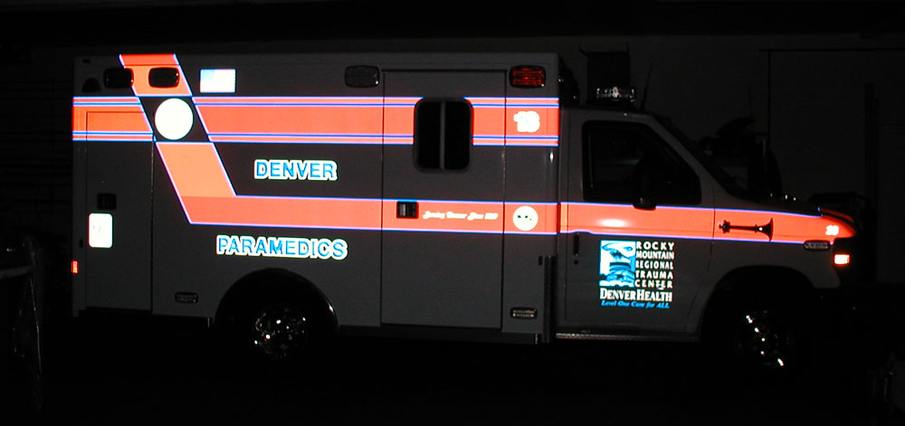
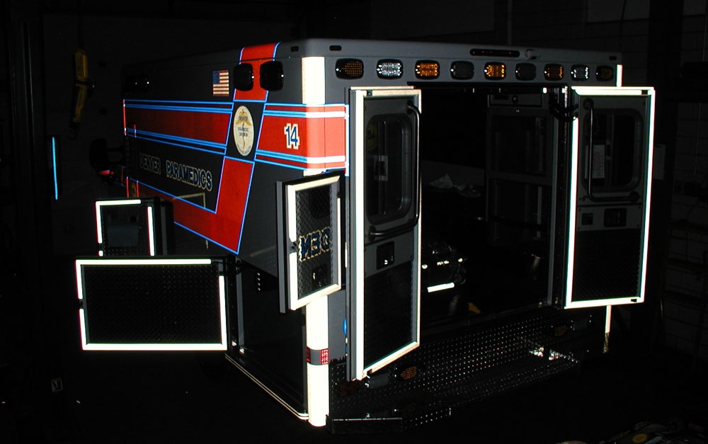
Denver Paramedics – Colorado
Immediately following the Ambulance Visibility presentation to the EMS Safety Summit in Colorado in October 2010, Denver Paramedics added vertical and baseline contour markings as well as door and hatch markings to enhance the nightime conspicuity of their ambulances. Thick reflective white bands were placed on the vehicle corners and all opening doors and hatches were outlined with reflective tape. The additional reflective markings clearly delineate the patient care module corners and any other doors or hatches that are open. The white reflective striping visible around the edges of the open doors quickly identifies the rectangular door shape to warn passing drivers. These markings clearly indicate and define the open doors around the ambulance.
Multi-striped chevron markings used on vehicles elsewhere are commonly affixed to the full inside surface of the open doors. This tends to confuse the simple door shape by displaying an increased level of visual complexity. Chevron markings will often make the doors less easily recognisable to passing drivers, especially if the rear of the ambulance also displays a chevron marking pattern.