The analysis used for vehicle paint colour is valid for warning lights. However, the light is no longer reflected from a surface. It is generated at the source and is directed by transmission to the viewer.
The Relative Spectral Sensitivity Curves are used again to show how human eyes perceive light.
The change in sensitivity and colour perception as the eye adapts from photopic to scotopic levels with the Purkinje shift also applies to transmitted light.
The Krovkov Effect reduces red sensitivity in a shift towards the blue regions of the spectrum is also a small factor in response to loud noise.
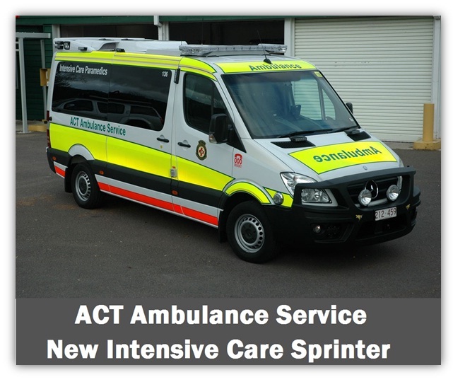
Much of the research into lighting emphasises that there should be a standardisation of vehicle body and light colours between each of the individual emergency services.
Both Solomon and Green make this point.
It is unnecessary for each organisation to display different colour schemes in an effort to identify the emergency vehicle’s particular owner.
Using this style of ID lighting slows reaction times as the viewer attempts to process the distinctive colours through the many different choices held in their long-term memory.
If all the emergency services in a country used a standard single colour or combination of colours then the reaction time is reduced.
There should be local agreement between organisations to achieve this aim.
As explained before, human vision peaks in the yellow-green region of the spectrum.
Note in an exception that …in dim light
with good brightness contrast, the colour of the signal light has little effect on reaction time (Solomon, p44).The different colours are outlined below in order of sensitivity.
Whitelight is the most affective attention-getting signal, containing all visible spectral wavelengths.
The main problem with white is the colour has no distinctive meaning, but it can be used with other colours as the “drawcard” or clearing light.
If a white light is not adequately separated from other lights it will overwhelm and dilute their colour.
White cannot bleed out like other colours at long distances, always remaining white. Although, at some viewing angles it can blend with distant headlights.
Powerful white beacons in use during darkness can produce strong glare, easily destroying the night adaptation of nearby emergency workers and approaching drivers.
Greenis not used by most organisations except for specialised tasks. This colour relates to “GO” and contradicts the danger emphasis often required for emergency vehicle lighting.
In Australia green is used as a command vehicle light, on park Rangers vehicles or as a colour for aerial recognition by medivac or patrol helicopters (handheld light or strobe).
Yellow (amber)is the best colour in common use. Yellow possesses the international interpretation of caution and warning.
In Australia, the use of yellow is not regulated and the colour is used for many different warning purposes (including turn indicators on vehicles). Yellow lights can be used in combination with red or blue to counteract yellow’s commonality, but the presence of the yellow lights with another authority colours may still confuse a small percentage of observers. Overseas, the combination of red and yellow is often regarded as the optimum pairing. (Krimsky, p51).
Individuals who are colour-blind can see yellows clearly, a positive advantage.
Yellow is extremely effective under all conditions, day and night, especially at dawn and dusk. However, yellow must be carefully controlled as it can still cause excessive glare at night when it can be very bright.
There is evidence that the intensity of a yellow light can be higher than that of a white light before being deemed unsatisfactory. The results of some investigations suggest that it can be up to 40% greater (Paine and Fisher, p8). Yellow at long distance and low threshold levels can bleed and change, then being perceived as white.
The intensity values for yellow signals need to be three times that for red for equal visual performance (Fisher and Cole, 1974). This will not normally be a problem since a yellow lens can transmit three times the light from an incandescent lamp over that for a red lens and therefore the wattage of the lamps needed will be the same (Paine and Fisher, p5)
Redis the traditional emergency service warning and the “stop or danger” colour. Red is instantly recognised as an urgency warning when used by emergency services and legislation covers its use. Red is also the brake and tail light colour for all vehicles. Red emergency lighting, if not rotating or flashing can sometimes be lost in a sea of red tail lights from other cars. Red does not bleed to white over long distances as other colours do. After yellow, red is the next best colour in daylight. The Purkinje Shift alters perception of transmitted red at night, although this effect is nowhere as pronounced as it is with reflected light from red surfaces at lower intensity levels. The Krovkov Effect can reduce the human perception of reds in some individuals. The use of a high transmission filter, passing red light containing a yellow component, increases the sensitivity of colour-blind individuals to red light sources (Green, p13). New car makers often use this red/yellow high transmission filter in red tail-light lenses or as their LED colour.
Magentais being used in Australiaby transport authorities, but is not often used by other agencies due to its weakened and confusing colour saturation formed between blue & red wavelengths.
Blueis regarded as the authority colour in many countries and has been heavily used by police in the past.
Legislation often covers its use on the roads.
Blue being unlike any other colour commonly found on the roads is highly distinctive and recognisable.
Blue can quickly generate an emotional response in experienced drivers due to its law and order history, thus producing relatively fast recognition and reaction times.
The blue coloured beacon or light can be washed out by strong skylight during the day, but its luminosity exceeds red at night. It is suggested but not confirmed by research, that blue has better perception in fog and snow conditions where high levels of diffuse light exist. The Purkinje shift moves toward blue sensitivity when the eye is in an adaptive state.
Blue is unaffected by the Krovkov effect but can be harder for the eye to focus on the source than other colours due to chromatic aberration.
According to De Lorenzo and Eilers (p 82/1332) the California Highway Patrol began to experiment with mixing different light colours in 1979. Since then every colour has been used on emergency vehicles. The colours most frequently fitted to vehicles are white, yellow, red and blue.